Recent News
OneOffixx increasingly popular in the healthcare industry
QR bill: How to add QR codes to OneOffixx invoices
Livit AG relies on template software by PrimeSoft
Aveniq increasingly uses OneOffixx
OneOffixx by PrimeSoft is now also in use at the Municipality of Baar
Municipality of Goldach: Yet another authority to use OneOffixx by PrimeSoft
Aktuelle Termine
- The OneOffixx Management Team is Complete
- OneOffixx Operations Started in Germany
- Microsoft Office 2019: The Latest News and Updates at a Glance!
- “A Clever Template Management System”: OneOffixx from an Employee’s Perspective
- Trends for Template Management Software & IT: A Look into the Future
- OneOffixx and Sevitec Informatik: Management Reinforcement
- OneOffixx Seals Partnership with AppSphere AG
- Visitor Rush at the DocuWare User Conference
- OneOffixx 2019 Release is available!
- DIGICON 2017: Second place for OneOffixx!
New icons for Microsoft Office… and how about OneOffixx?
Our technological understanding is ever changing with giant steps. As such, the future-oriented developments of the last couple of years include saas business models, cloud computing or machine learning, among others.
Innovations by Microsoft across platforms
As always, Microsoft responds to the latest developments with a wide range of innovations. The change from the Windows client to a comprehensive system running on all platforms and devices is already in progress.
Already a few years ago, Microsoft launched the cloud-based subscription service Office 365. It enables the location independent work with Office on all devices and across different platforms. The popular Office suite is now available for Windows, Mac, iOS and Android.
Recognition value of the new Microsoft Office icons
The new era is now also reflected in the design of Microsoft Office. For Office 365, new icons were recently presented. They visually emphasize and depict the latest developments of the technological market. The new icons are introduced step by step across devices, platforms and generations. They are now used for both apps and on the Windows software.
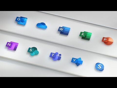
Source: Microsoft Office 365 channel on YouTube
The new icons show stronger, brighter and more vivid colors. The design is clear and more simplistic in comparison to previous versions of the Office icons. At the same time, the facilitated visual layout is combined with the well-known Office symbolism. This way, the recognition value of the icons is guaranteed.
Process of change is reflected in the design
It is for the first time in five years that Microsoft decided to change the design of the Office icons. The new design is thought to reflect the current process of change, as well as the new platform independence of the Office suite. “This allows us to maintain familiarity [of the Office symbolism] while still emphasizing simplicity when inside the app”, writes Jon Friedman (Head of Microsoft Design) in an article on the new design.
The new Office package and its updates include new features in the areas of artificial intelligence, teamwork and voice recognition. “In the end, it’s great design that makes these experiences fluid and seamless”, Jon Friedman points out.
A new icon for OneOffixx?
The OneOffixx software completes Microsoft Office and is always on top of the latest developments. The renowned OneOffixx standard software has been following the steps of Microsoft for many years.
OneOffixx clients can always rely on a seamless, fast and smooth migration to new Office versions and platforms. As a next step, the OneOffixx Add-in for Word will be released shortly.
A new icon – YES or NO? Your opinion counts!
The question is now whether OneOffixx should also change the design of its icon in line with Microsoft Office. So far, the well-known OneOffixx icon has remained unchanged for seven years. A first, general draft for a new design is now available:

We are very interested in the feedback of our clients, partners and OneOffixx staff members. Should OneOffixx change its icon and let it act as a signal for the current developments in the technological market? What do you think?
A new OneOffixx icon – YES or NO: Fill in our short survey (in German) here.
We highly value your opinion and very much look forward to receiving your vote or your email message!
